The Old System Created Errors by Default
In government contracting, employees routinely split time across multiple projects, and each project can include multiple charge lines with different budgets, effective dates, expiration dates, and constraints. When someone charges to the wrong line (or keeps charging after hours are exhausted) it creates a cascade of cleanup work for project managers.
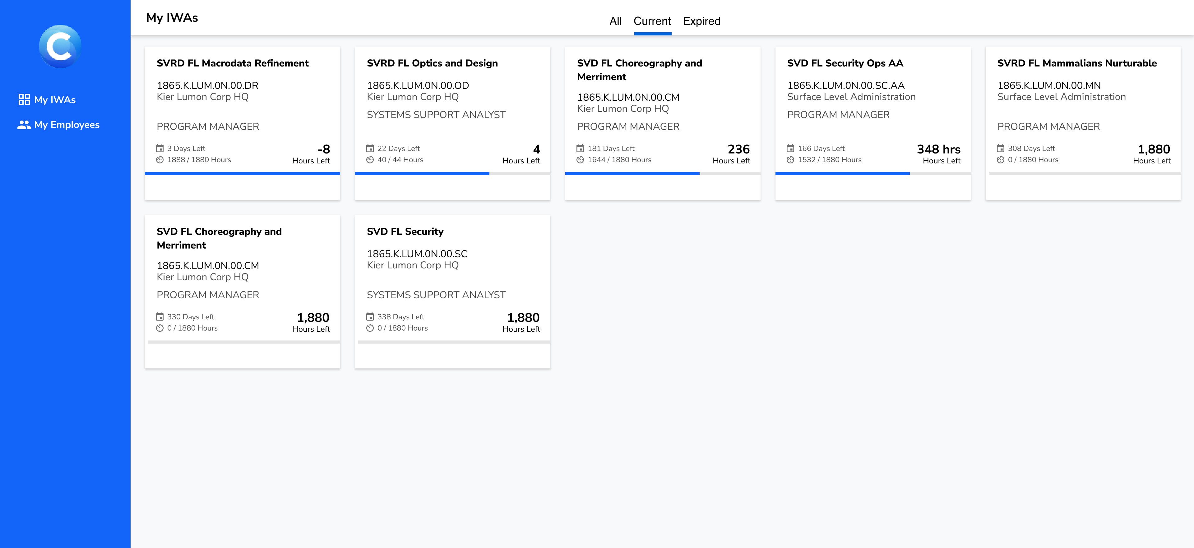
The original Profile experience technically contained the right information, but didn't help users act on it. Healthy items looked identical to broken ones. A card view with poor visual hierarchy contributed to the problem, making information difficult to read and impossible to sort. Users relied on managers to manually flag issues, often via email.
Beyond the UI, many employees weren't even in the system, because their assignments weren't being created through the workflow that feeds Profile. Managers were forced into a workaround loop of manually tracking hours and sending guidance emails, which increased error risk and wasted time.
Scan, Don't Browse
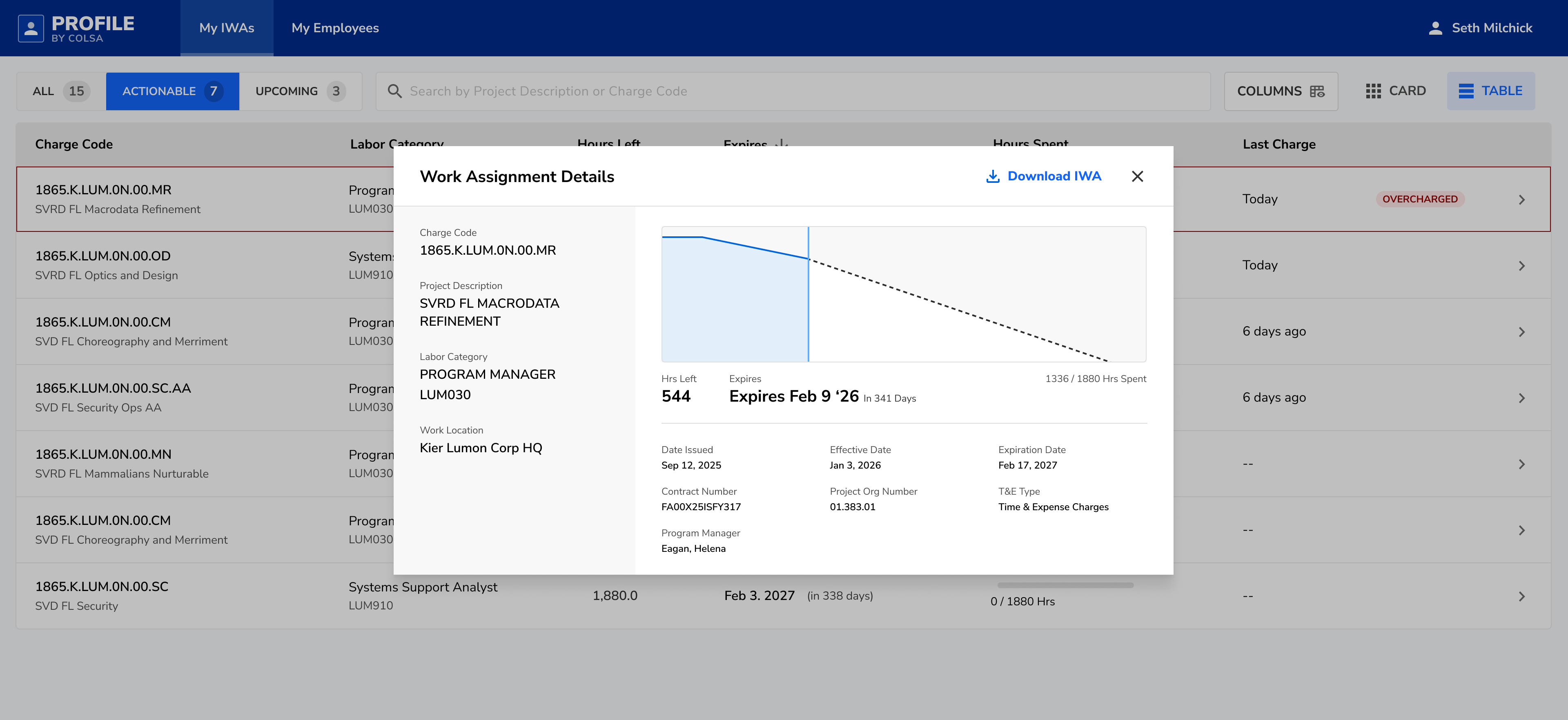
Profile is supposed to help employees understand their work authorizations quickly: Where can I charge today? What's about to expire? Is anything broken that I need to fix? The redesign reorganized the experience to surface answers to these questions most prominently and filter out noise.
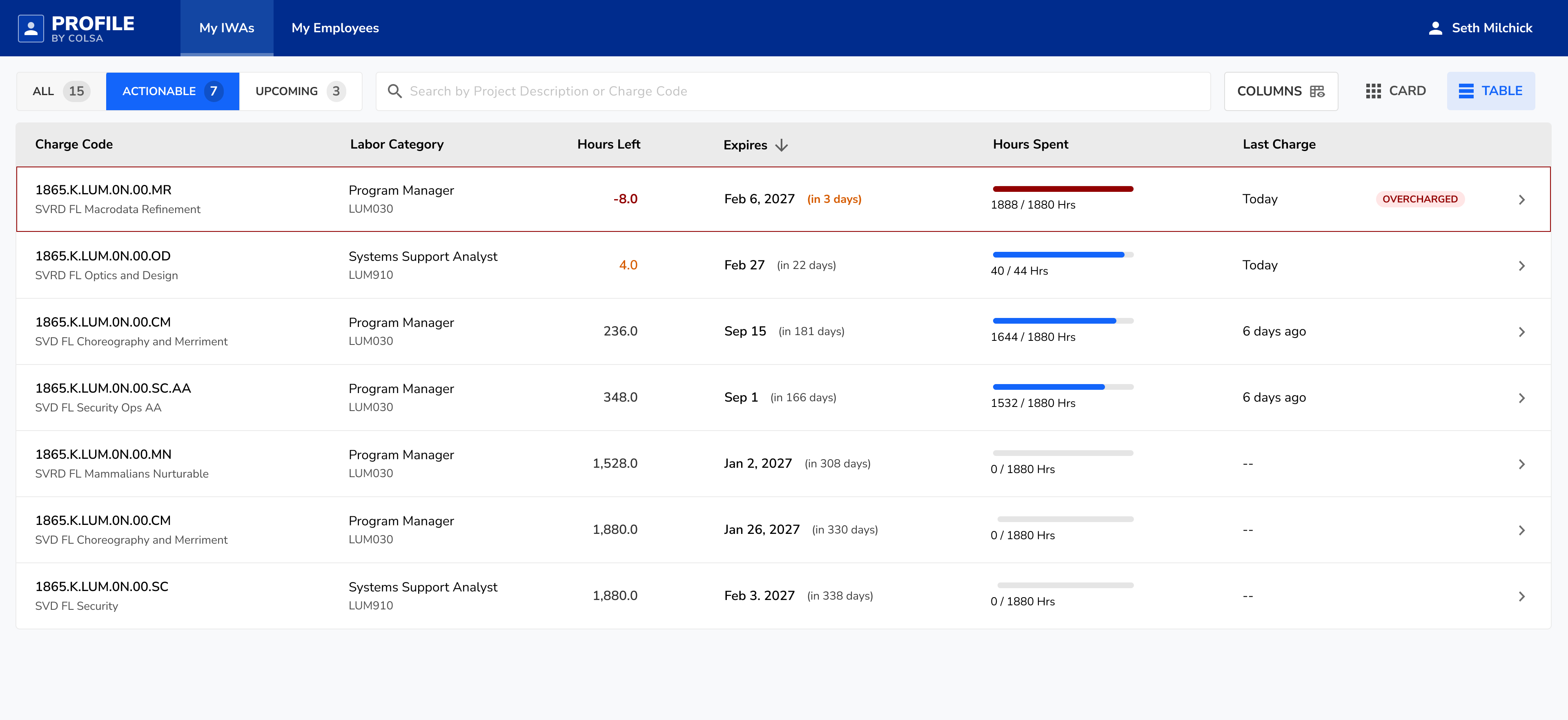
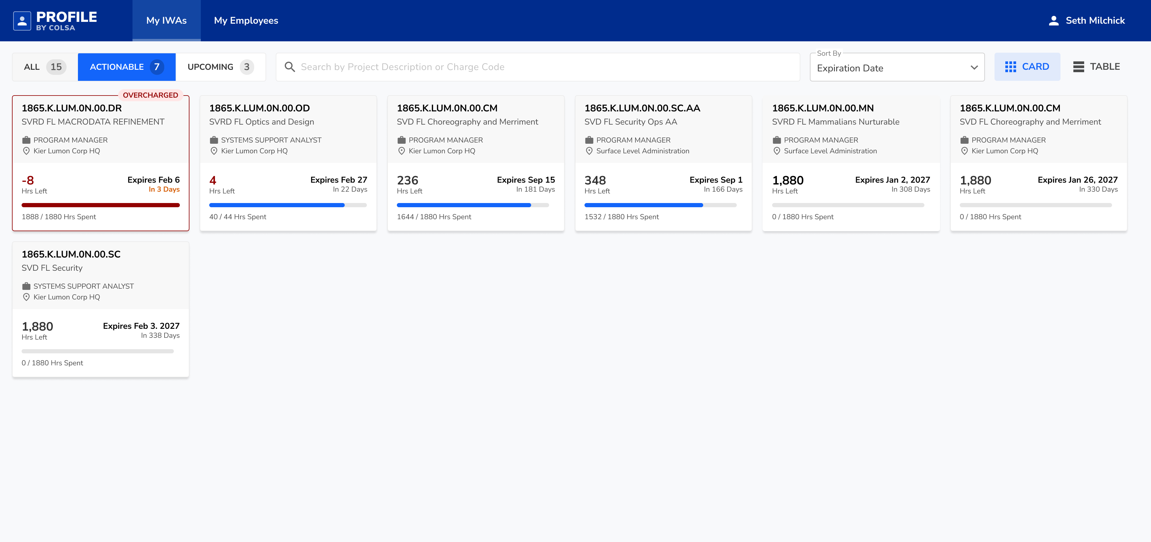
Key signals were grouped and visually prioritized so users could assess an authorization without reading every field. Overcharged items were visually flagged, remaining hours and time sensitivity were easy to spot, and new or noteworthy items didn't blend into the background.
Density When You Need It
For users with many authorizations, a table view provided compact scanning with sortable columns while preserving the same status language. Sort by expiration to surface urgency. Sort by remaining hours to identify authorizations running low.
Matching How Users Think
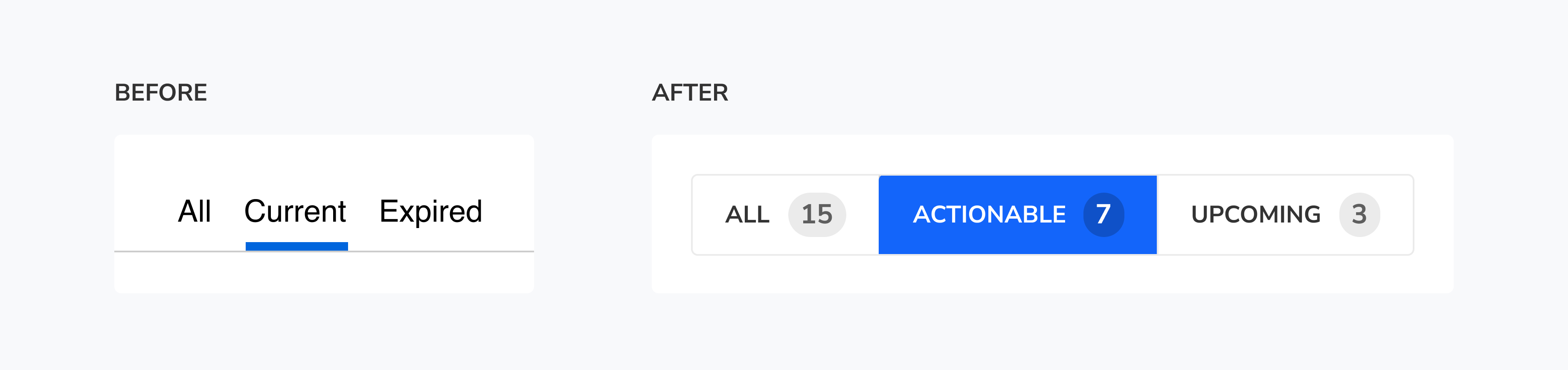
The old tabs were All, Current, and Expired. But "Expired" wasn't a view users needed. People needed to know what they could charge to at any given time, and what was coming next. We reframed the experience around three modes: All for full context, Chargeable for items effective today and still relevant, and Upcoming for future authorizations so users could anticipate transitions and avoid last-minute confusion.
We also added a 'Last Charged' column to help disambiguate similar items. Many work authorizations have nearly identical project names and codes, which are often strings of random-looking characters. When users are moving fast, past behavior is the easiest way to pick the right one ('This is the one I used yesterday.').
Beyond a UI Redesign
In addition to refreshing the UI, we improved the surrounding workflows so the right data existed, the right people received it at the right time, and it was harder to miss key information.
Upstream adoption: Before Profile could prevent errors for employees, it needed a reliable source of truth. We improved the manager-facing planning tool where effort is allocated and added a tightly integrated workflow to push updates into work authorizations in one or two clicks from the same screen.
Proactive prevention: We added automated email alerts when someone overcharged an authorization, routed to users' government-site email addresses when needed, since many employees couldn't access their company email during the day.
Manager dashboard: We created a dashboard for managers that surfaced overcharges across direct reports in a single view, with a one-click reminder email built in. Managers could still reach out personally when needed, but the default path was faster and more consistent.
Results
Profile and its surrounding improvements shifted work authorization management away from email threads and memory, and toward a system that prevented errors through better data, better timing, and clearer UI. Time spent on error resolution decreased by 42%, unresolved overcharges decreased by 65%, and user satisfaction averaged 4.7/5 in post-rollout surveys.
Managers reported a much easier time managing overcharges, previously a major source of frustration.