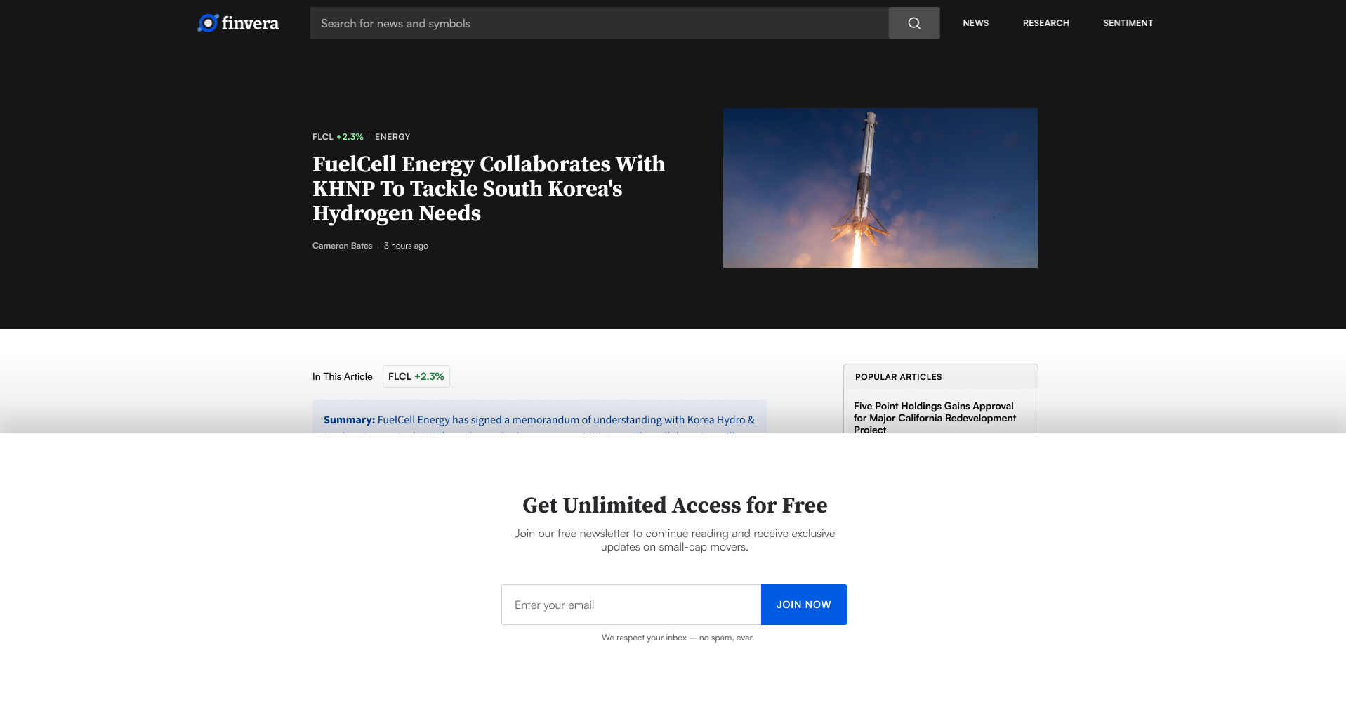
Earning the Email
The biggest UX challenge was converting visitors without feeling pushy or gating too much content. Flooding the site with ads would undermine our minimalist design strategy, which was meant to distinguish us from competing sites that tend to bombard users with flashy promotions. But hiding too much behind a freewall risked driving up the bounce rate. We needed emails, and we needed to earn them.
The solution was a set of promotional banners, visually consistent with the site's design language, that framed our newsletter as an exclusive resource: "Your unfair advantage in small-cap investing, delivered twice weekly." "Get Finvera's premium newsletter 100% free." The promotions were prominent but never distracting or intrusive. And beneath the email input field, a short line read: "We respect your inbox - no spam, ever." Once a user had read three articles, a soft freewall prompted them for their email before unlocking additional content.
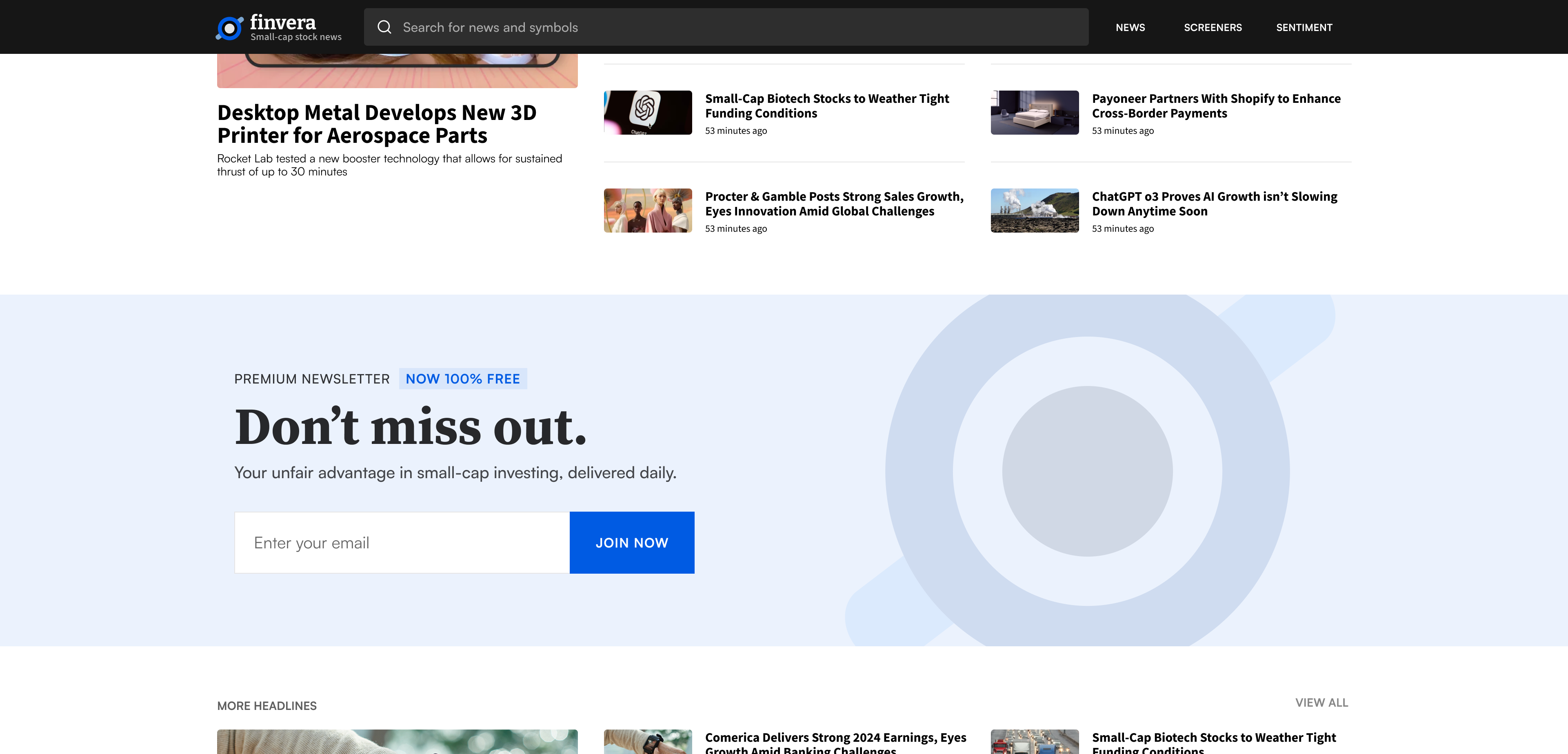
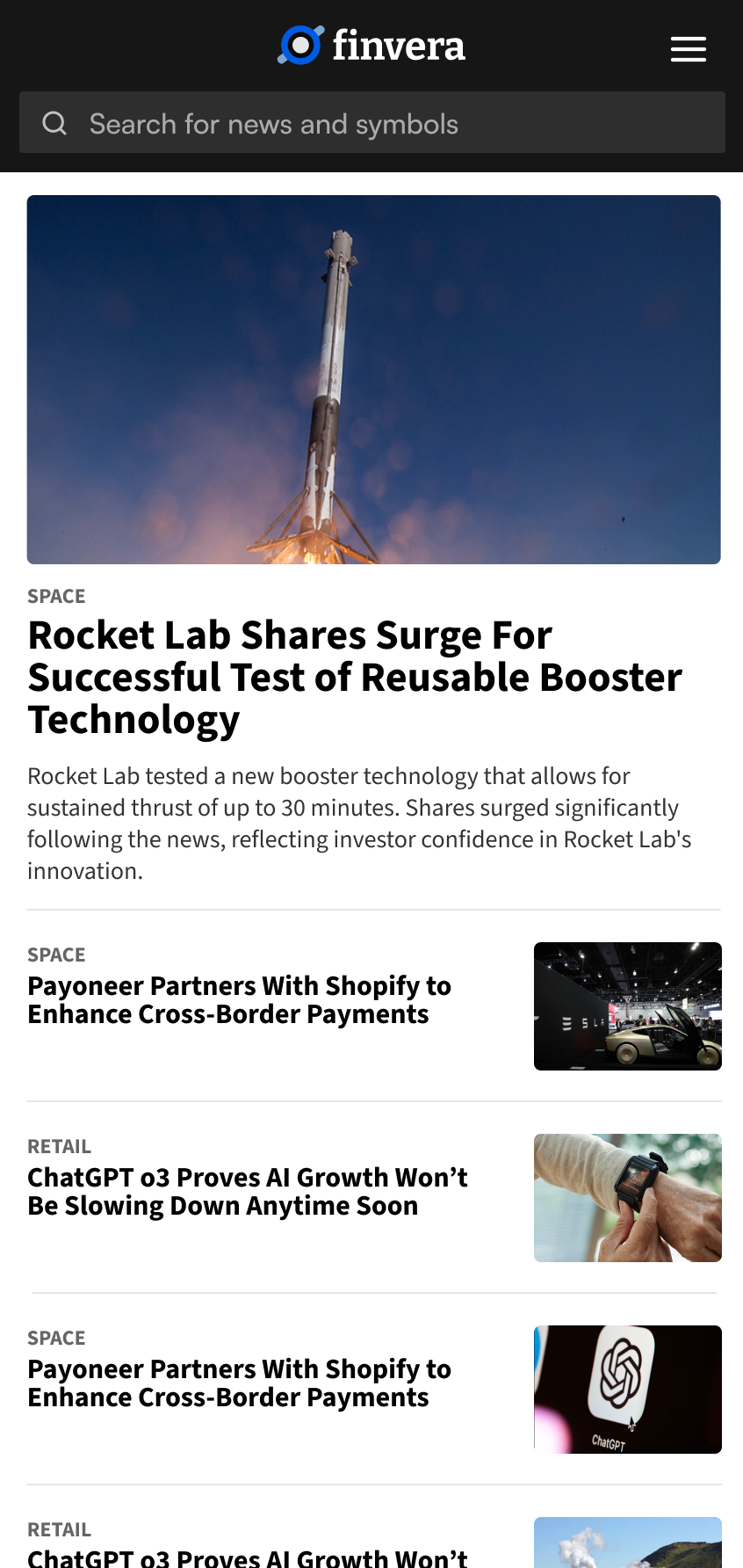
The Front Page
The site needed to communicate Finvera's value as a provider of small-cap news, data, and market sentiment without overwhelming the reader. The goal was to position Finvera as the resource for understanding why small-caps move and where they're headed next. I explored several layout directions before landing on a structure that felt both scannable and editorial, somewhere between a financial dashboard and a news front page.
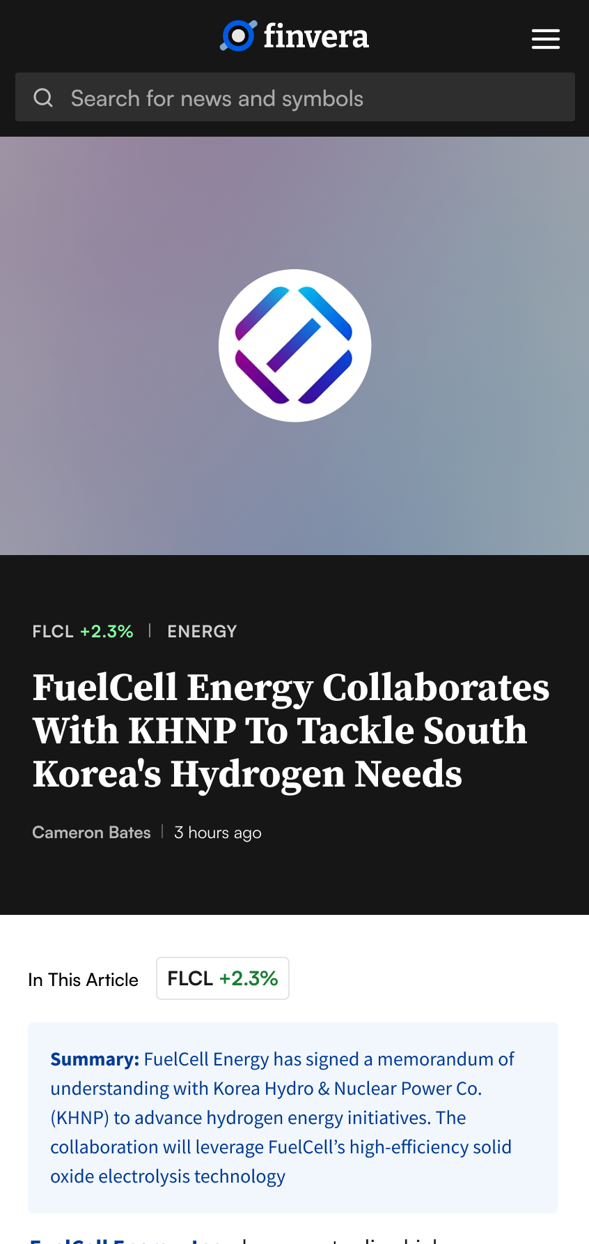
Solving the Image Problem
Compelling visuals drive reader engagement, but sourcing quality images is time-consuming and expensive. As a startup, Finvera didn't have a deep image library to draw from either. I designed a fallback system: when a ticker is the subject of an article, the site pulled the company's logo, detected its dominant color, and generated a matching background gradient. This gave every article a polished, distinct look in feeds and share previews without sourcing or licensing images for every post.
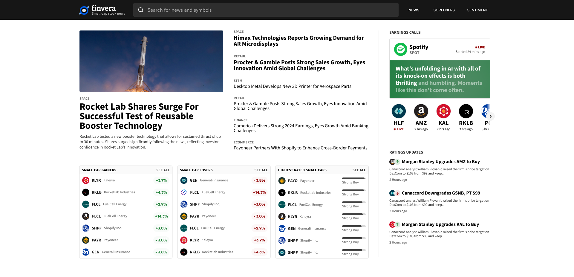
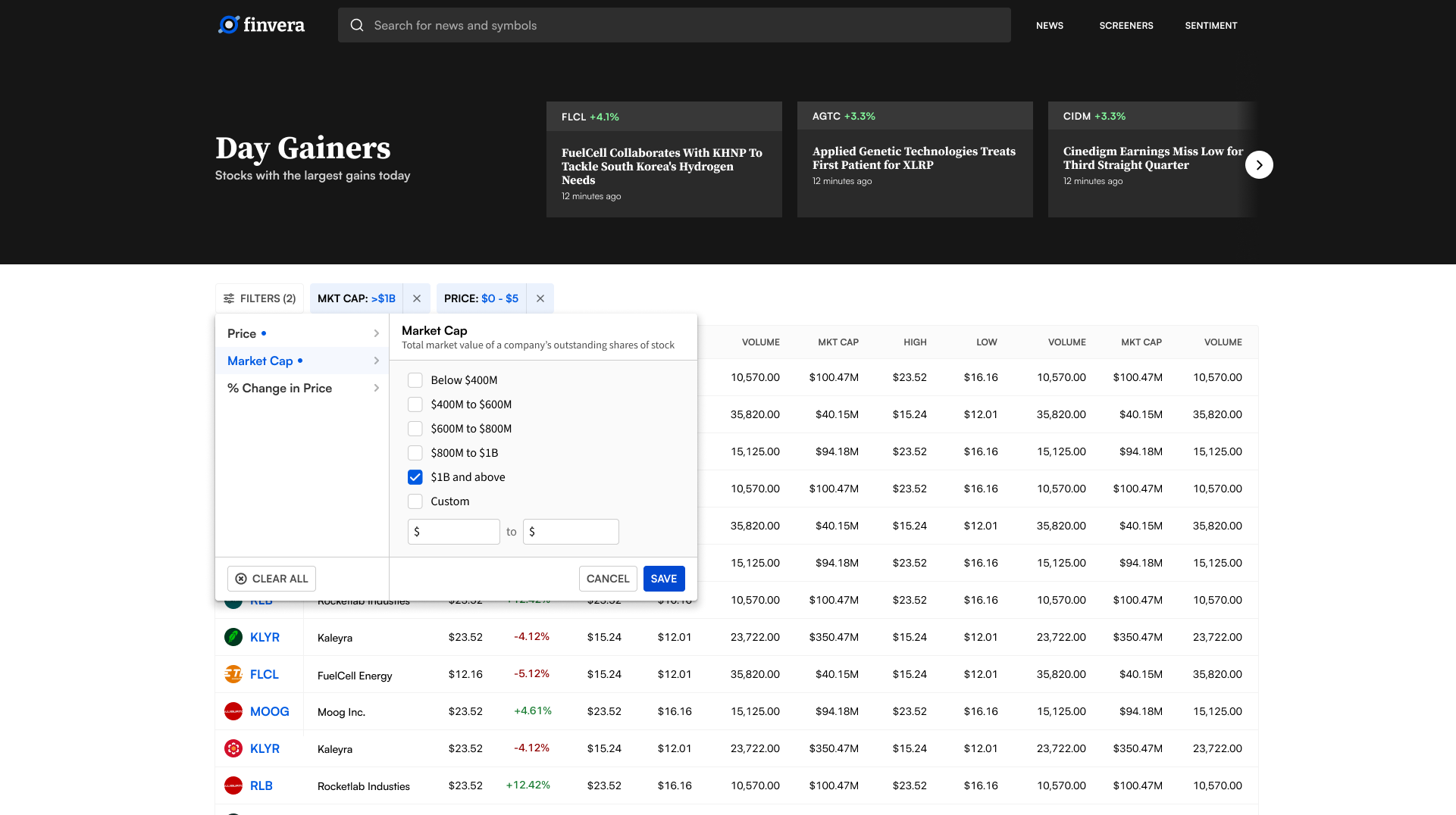
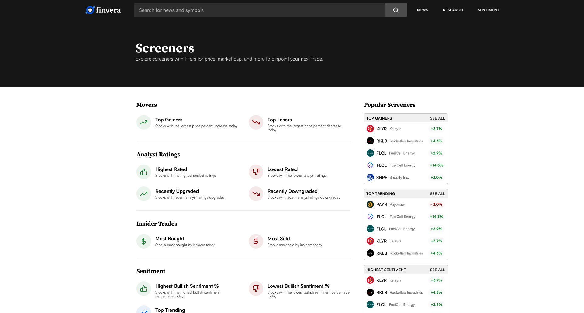
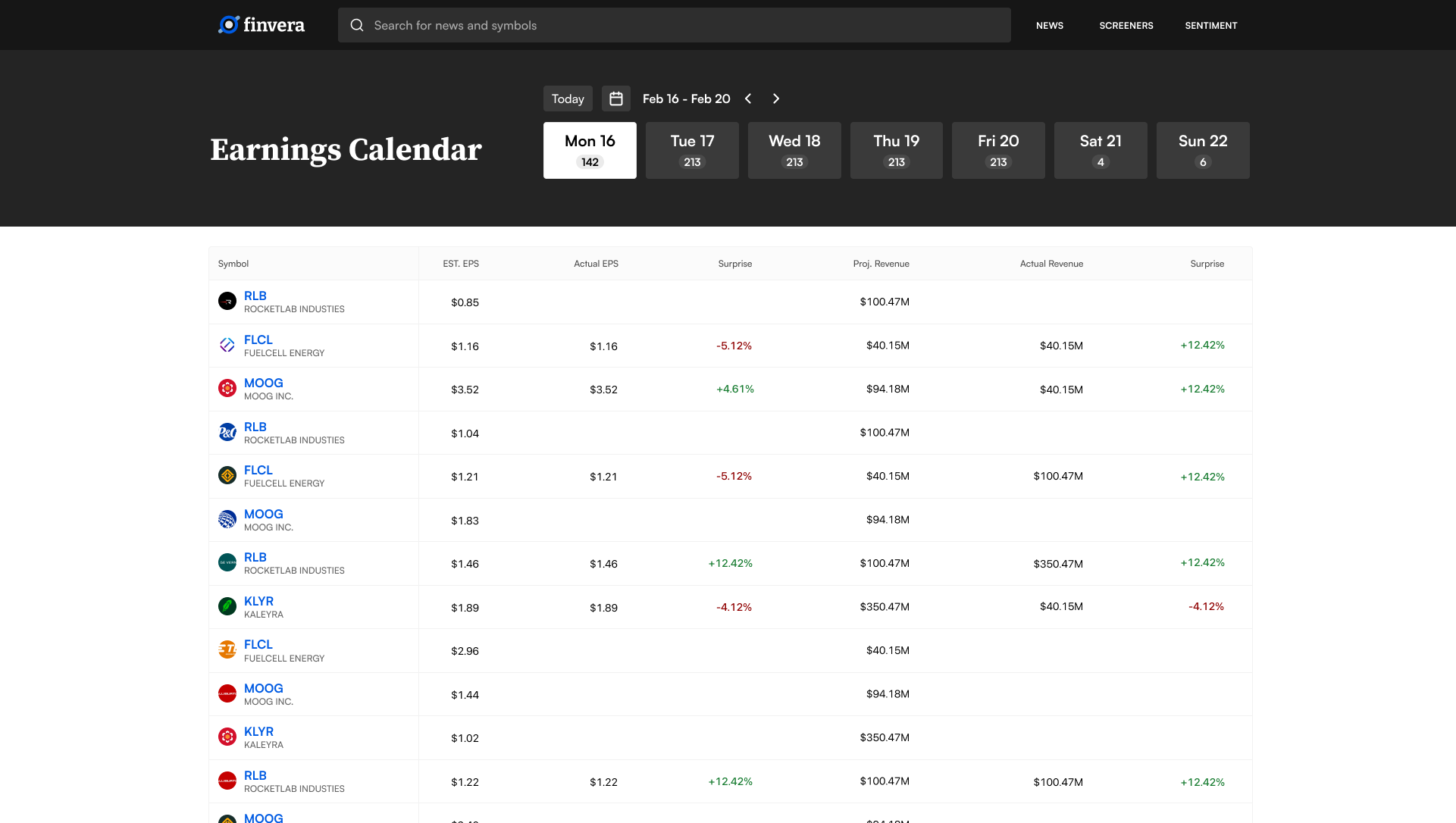
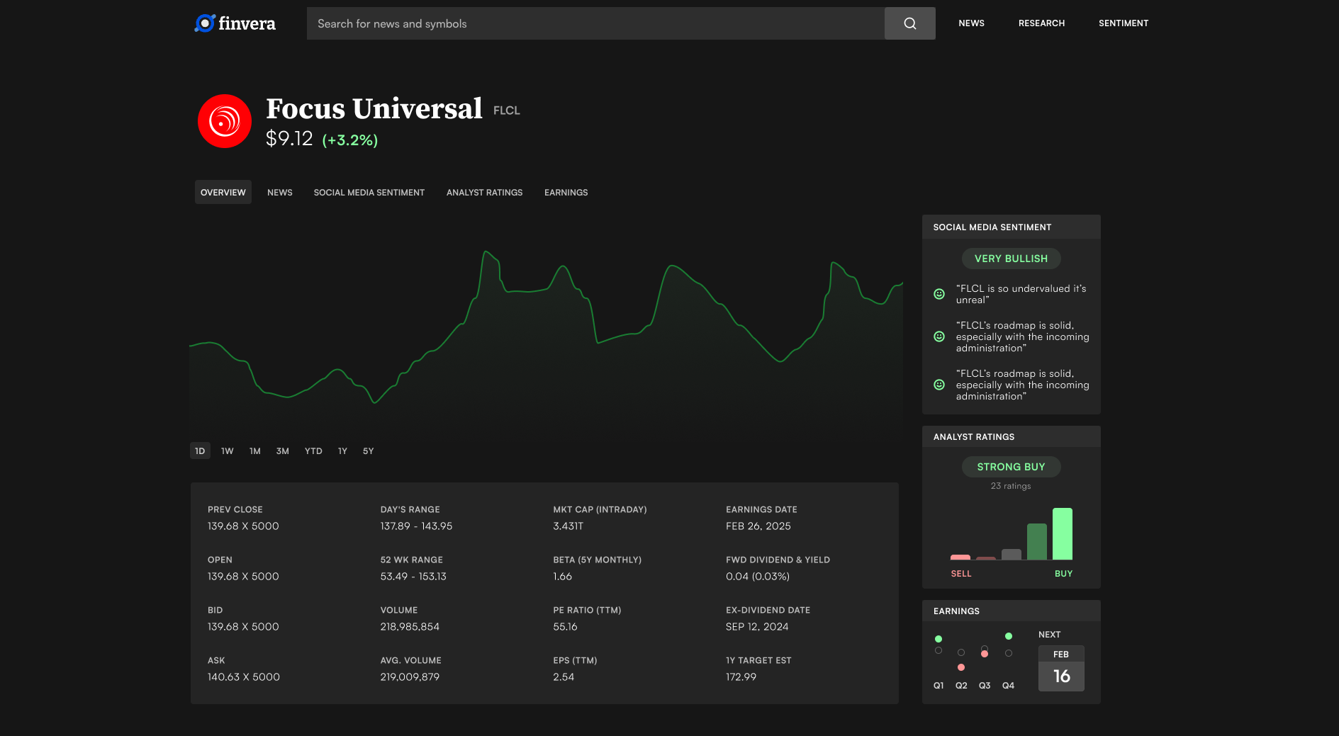
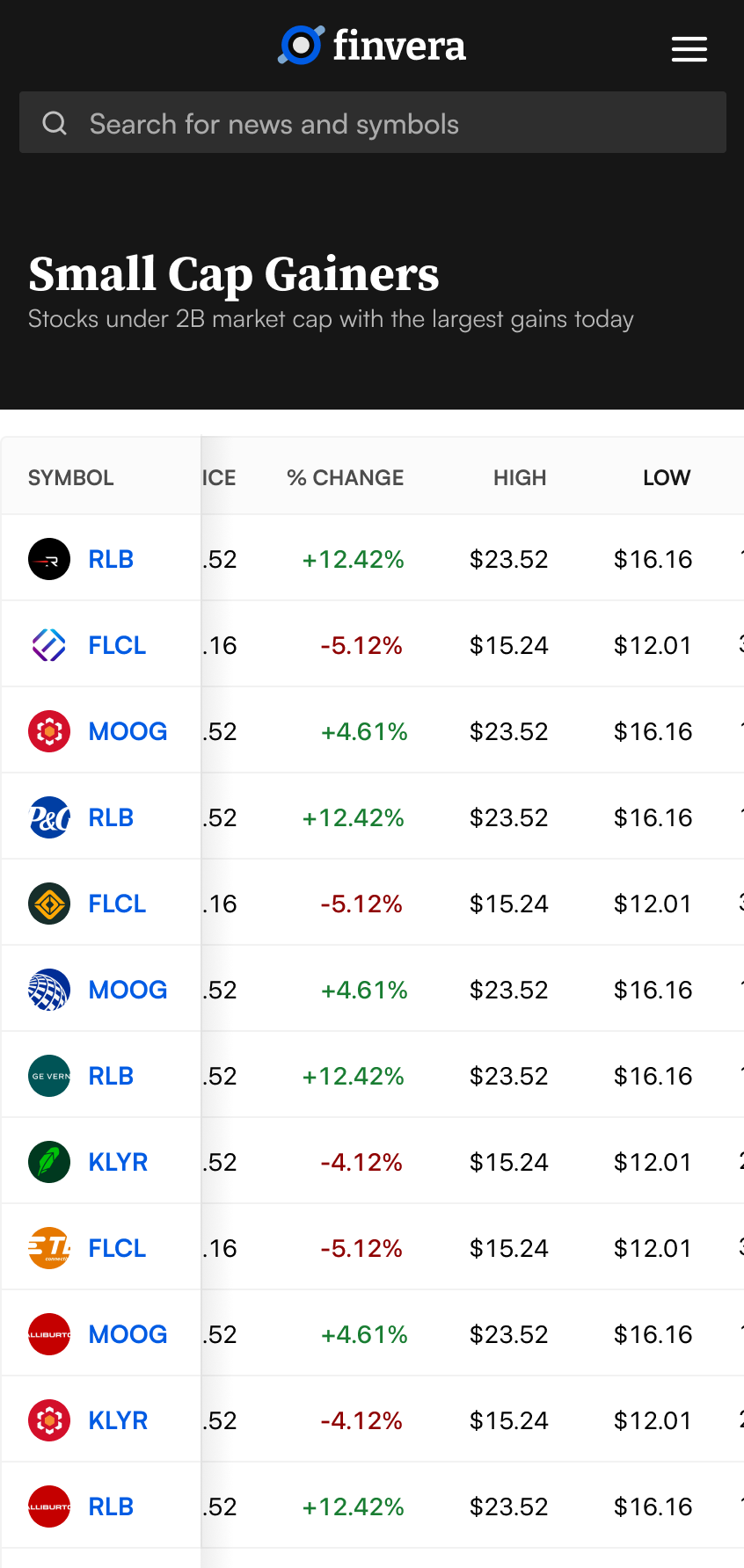
Making Dense Data Usable
The platform included stock screeners, earnings calendars, individual quote pages, and live earnings call transcripts. The design focused on making complex filtering feel straightforward, supporting real workflows without overwhelming users with options.
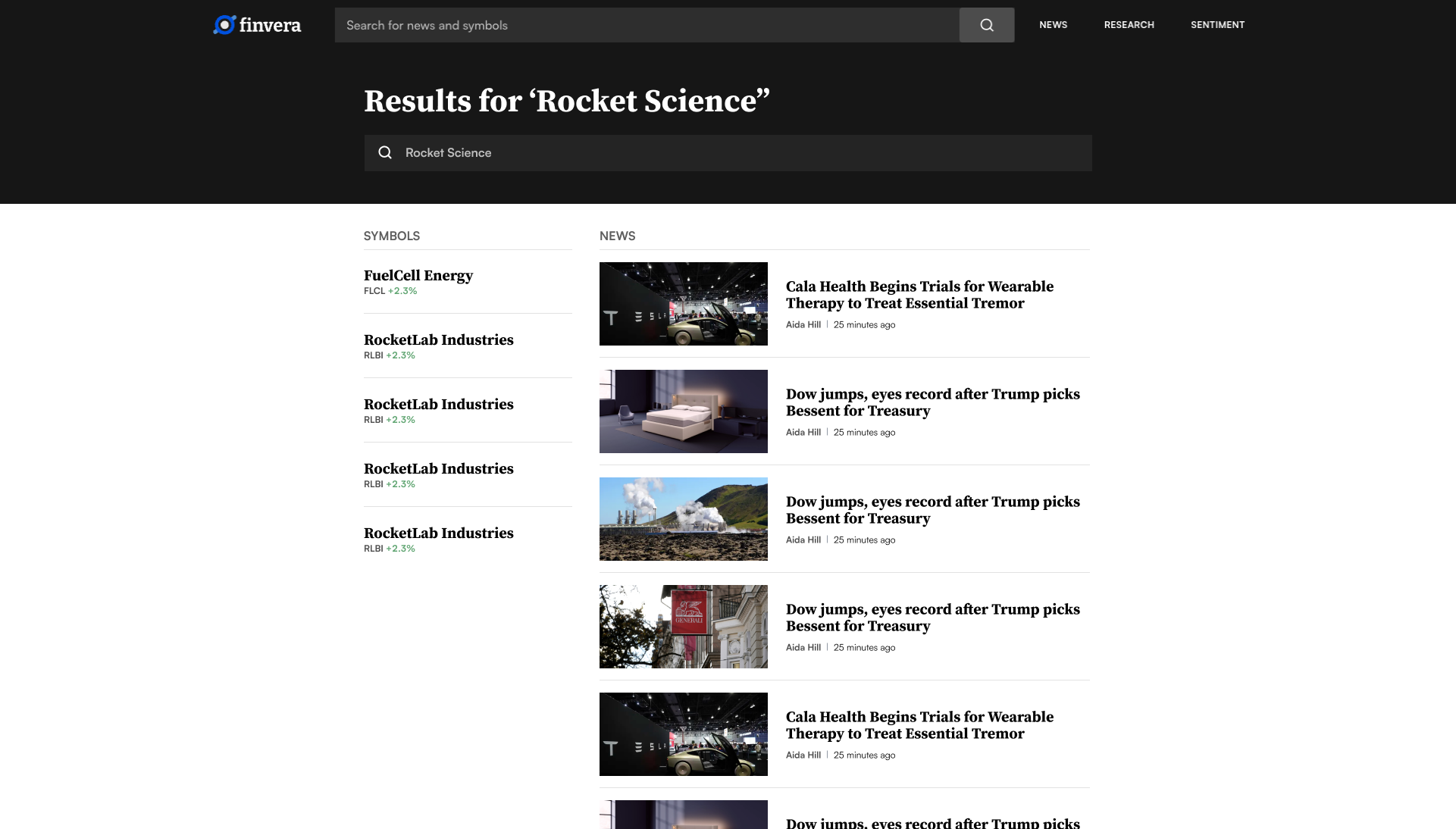
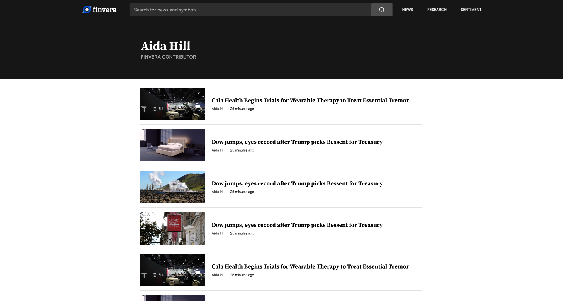
Search, Profiles & More
Search results, contributor profiles, and utility pages rounded out the platform. Every page maintained the same typographic scale and layout grid, so even rarely-visited pages felt like part of the product.